Ever feel like your social media posts are stuck in a black hole? You post, you wait, and then… crickets. But then, one random post takes off, and you’re left wondering, What’s the winning formula?
The answer lies in social media algorithms. These sneaky little formulas decide who sees what on every platform, from Instagram and Facebook to TikTok and Pinterest. It’s like each platform has its own personality, and if you know what it likes, your content can get way more attention.
Mastering these algorithms means more views, more engagement, and maybe even going viral! And while it might sound like rocket science, it’s actually just a bunch of rules, ones you can learn and use to your advantage.
In this guide, we’ll analyze the algorithms on all your favorite platforms, reveal why they keep changing, and give you tips that can help your content pop. Plus, I’ll explain the latest tricks for beating the Instagram algorithm, the Twitter algorithm, and more.
First, understand –
What is a Social Media Algorithm?
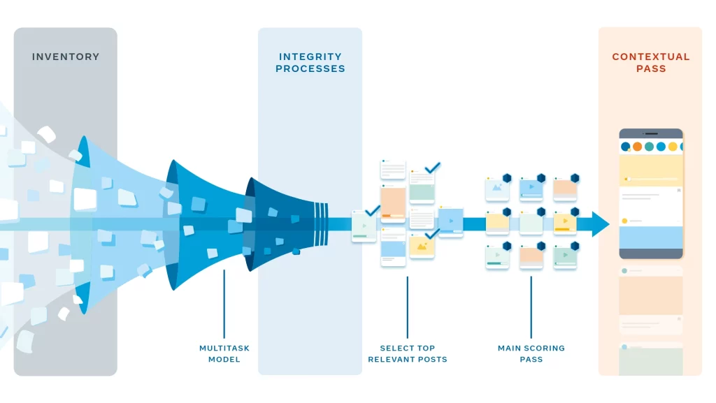
A social media algorithm is the system that decides what content you see on social media platforms. This set of rules determines how posts, videos, or ads are ranked and displayed in your feed. Social Media algorithms analyze factors like user interactions, content quality, and posting time to predict what you’ll find most interesting.
Each platform uses distinct algorithms designed for its specific audience’s behavior. For example, Instagram focuses on engagement and relevance, while TikTok prioritizes trends and short videos.
Understanding these algorithms allows creators and businesses to tailor content that matches platform requirements and improves visibility.
How Social Media Algorithms Rank Content on Different Platforms
Alright, let’s get to the juicy part. If you want your posts to reach more eyeballs, it helps to know what each platform likes to see.
Spoiler alert: every platform is a bit different, so let’s break it down:
1. Facebook Algorithm: Keep It Real
[Source: Facebook]
Facebook’s algorithm is all about building connections. It wants to show people content they’ll find meaningful, which is a fancy way of saying it ranks posts that spark conversations. So, if your post has comments, shares, and lots of reactions, it’ll float up in your followers’ feeds.
Tip: Facebook loves meaningful posts. Encourage your followers to comment and share their thoughts, not just hit the “like” button. Also, consider using Reels and Stories; Facebook’s giving them extra love these days.
Read more on how Facebook algorithm works here.
2. Instagram Algorithm: All About Engagement and Interest

Instagram doesn’t just have one algorithm; it’s got a few! Your Feed, Stories, Explore, and Reels each have their own set of rules. But the basics are the same: Instagram wants to show you content from accounts you interact with the most. It also looks at how likely you are to comment, save, or share a post.
Tip: Try using interactive stickers in Stories (polls, questions, quizzes) to get more engagement. Instagram loves content that gets people to tap, swipe, or type.
For the latest on the new IG algorithm, check this out.
3. TikTok Algorithm: Entertainment is Key
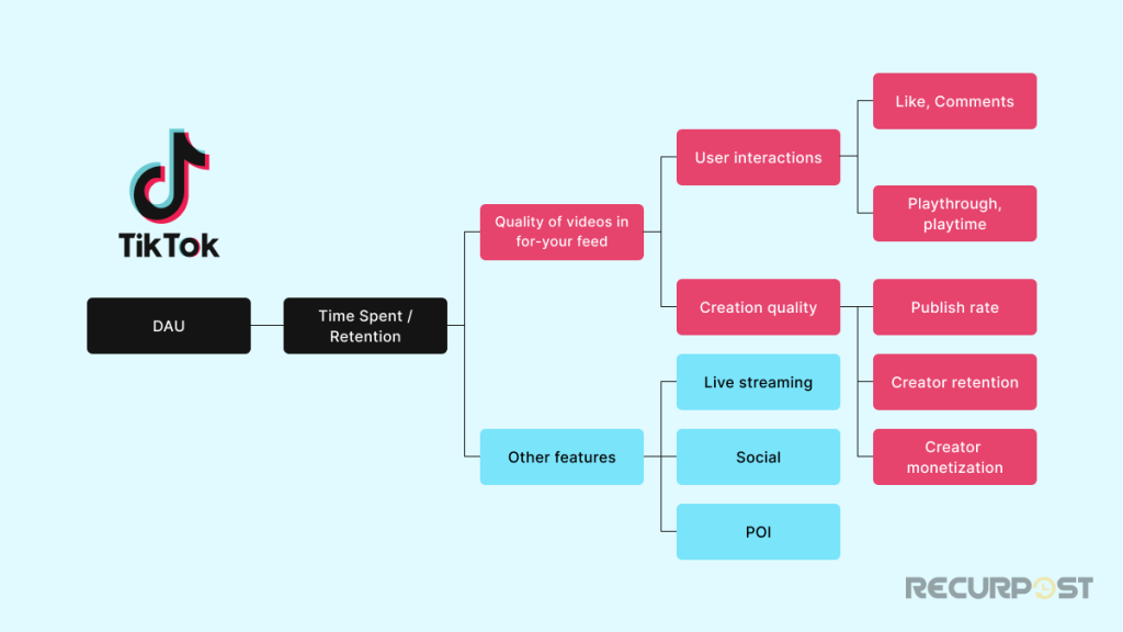
TikTok algorithm is basically like a good friend, it knows exactly what you’ll like before you do! This platform isn’t focused on who you follow; it’s all about your interests and what you’ll engage with. TikTok’s “For You” page is built from a mix of your past interactions,popular social media trends, and, of course, those catchy sound bites everyone’s using.
Tip: Keep it snappy. TikTok loves quick, entertaining content that hooks viewers right from the start.
Learn how TikTok algorithm works in detail.
4. Twitter Algorithm: Fresh and Fast
Twitter’s algorithm is obsessed with what’s happening right now. Recent tweets, trending topics, and interactions drive the content you see. Unlike other platforms, Twitter is a mix of real-time posts and recommended content. The more you engage with a topic, the more Twitter will show you similar tweets.
Tip: Timing is everything. For the best results, tweet when your followers are most active, and don’t be shy about joining trending conversations.
Here’s more on how Twitter algorithm does its thing.
5. LinkedIn Algorithm: Professional Connections First

LinkedIn’s algorithm is like the networking enthusiast who knows exactly who you need to meet. It prioritizes posts from people in your network, along with content relevant to your industry. LinkedIn loves posts that drive early engagement, especially from your connections.
Tip: Start conversations with a question or share industry insights to spark discussions. LinkedIn values informative, share-worthy content.
Get the scoop on LinkedIn algorithm here.
6. YouTube Algorithm: Watch Time is King
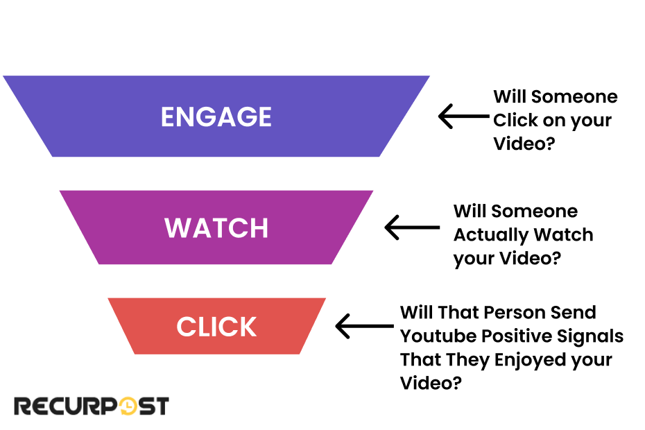
YouTube algorithm timeline is pretty straightforward: it ranks videos that keep people watching. Watch time, engagement (likes, comments), and relevance are the big factors. YouTube also suggests videos that are often watched together and tracks your interests over time.
Tip: Keep viewers hooked with strong intros and a clear purpose for each video. Create playlists to boost your watch time.
Take a look at the details of YouTube algorithm here.
7. Pinterest Algorithm: Quality Pins Win
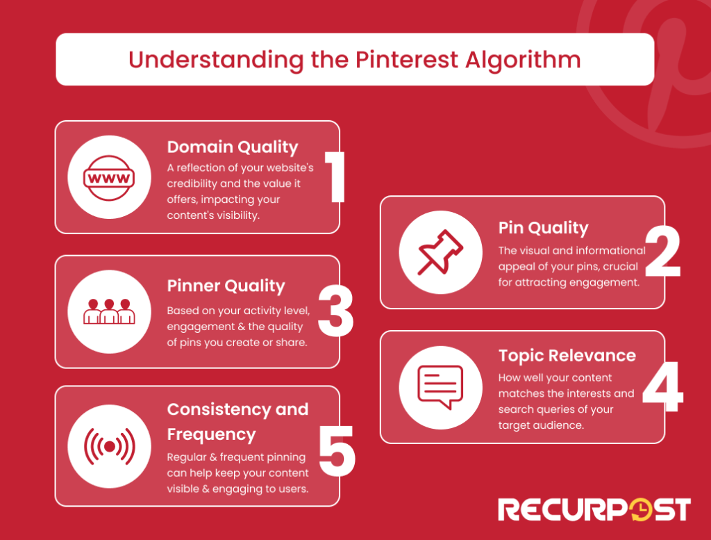
Pinterest is all about quality visuals and informative content. Pins that get saved, repinned, or clicked through are likely to show up more. Pinterest also rewards links to high-quality sources, so if your pins lead to a helpful website, you’re golden.
Tip: Use high-quality images and relevant keywords in your pin descriptions. Pinterest loves evergreen content that stays useful over time.
Learn more about how Pinterest algorithm works here.
Each of these platforms uses different ranking signals to determine what gets seen, and by knowing what they prioritize, you’re setting your content up for success.
Why Are Social Media Algorithms Important?
Social media algorithms deliver content that aligns with users’ interests and maintains engagement. Without algorithms, feeds would show every post chronologically, creating an overwhelming experience. Algorithms show users relevant content based on their preferences and behavior.
For brands, influencers, and small businesses, social media algorithms connect content with the right audience. Content aligned with platform ranking signals like engagement, video performance, or account activity gains more visibility and follower connections. This helps content stand out in crowded digital spaces.
Why Social Media Algorithms Keep Changing
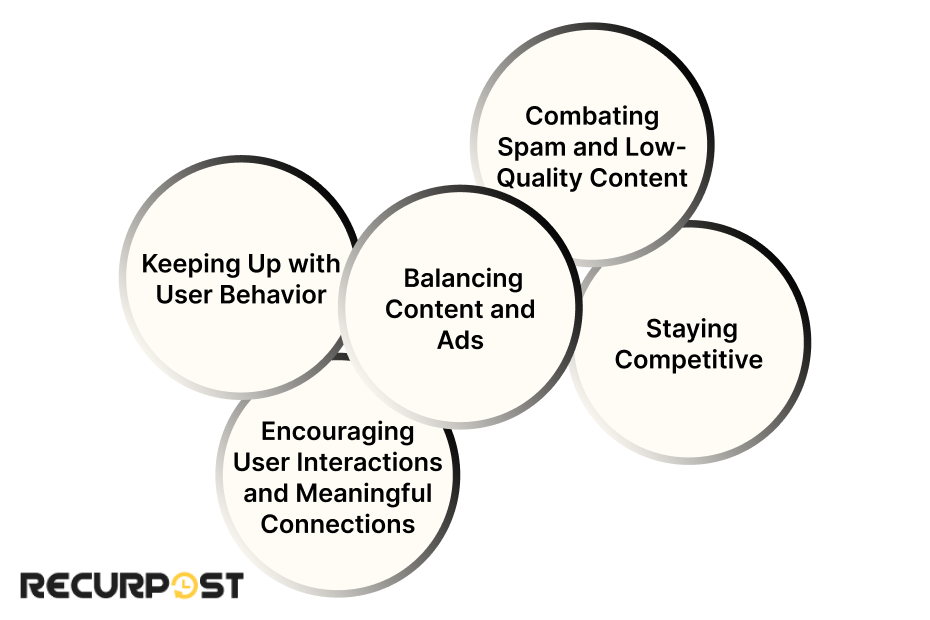
If it feels like social media algorithms change every five minutes, that’s because… well, they kind of do! But there’s a reason behind it. These platforms want to keep us, the users, engaged and happy. That means they’re constantly tweaking their algorithms to make sure we see content that’s fresh, relevant, and interesting.
1. Keeping Up with User Behavior
Platforms like Instagram, TikTok, and Facebook are always studying user behavior. If they notice more people are watching videos over photos, guess what? Their algorithm will start favoring videos. Social media platforms adapt to what users are enjoying most, which is why certain content types might suddenly see a boost in reach.
2. Balancing Content and Ads
Social media companies need to keep users on their platforms without bombarding them with ads. To do this, they change their algorithms to balance organic posts with ads in a way that feels natural. This way, they can keep the ad money flowing while making sure people don’t get frustrated and log off.
3. Combating Spam and Low-Quality Content
Social media algorithms are like quality control for content. They’re designed to filter out spammy or low-quality posts that don’t provide much value to the audience. If a post looks like clickbait or gets a ton of negative feedback, it’ll likely get pushed down in the feed.
This is why creating high-quality content is so important; it helps keep your posts in favor with the algorithm.
4. Staying Competitive
Let’s be real, there’s a bit of rivalry between social media platforms. If TikTok is getting a lot of love for its short videos, other platforms like Instagram and YouTube might start pushing their own video features (like Reels and Shorts) harder. Algorithm updates are often a way for platforms to stay competitive by mimicking what’s working elsewhere.
5. Encouraging User Interactions and Meaningful Connections
In recent years, platforms like Facebook and Instagram have updated their algorithms to emphasize “meaningful connections.” This means they want people interacting with each other, not just scrolling endlessly. Posts that get comments, shares, and save interactions are prioritized because they’re more likely to bring people together.
Each algorithm change impacts how content appears on a user’s feed, so staying updated can make a big difference. Understanding these shifts helps maintain an agile content strategy that performs well.
Major Algorithm Updates in 2025-26
August 2025 introduced major changes across social media platforms affecting creators and businesses. The updates prioritize content authenticity, user safety, and personalization.
Instagram and Facebook Updates:
Meta rolled out enhanced AI detection systems that better identify authentic engagement versus artificial interactions. The algorithm now places greater weight on genuine comments and meaningful conversations, while reducing the reach of posts with suspected bot engagement.
TikTok Changes:
TikTok introduced new ranking factors that prioritize original content over reposts. The algorithm now gives extra visibility to creators who consistently produce unique videos rather than recycling trending content.
LinkedIn Adjustments:
LinkedIn’s professional network updated its algorithm to surface industry-relevant content better and reduce promotional posts that don’t add professional value.
Twitter/X Modifications:
The platform refined its real-time content delivery system to balance trending topics with personalized interests better, making feeds more relevant to individual users.
The August 2025 changes prioritize authentic engagement and original content for maintaining strong algorithm performance.
Top Tips to Boost Your Reach on Each Platform
Now that you know why algorithms change, let’s talk about how to make those changes work in your favor. These are some tried-and-true strategies to help you show up more often in users’ feeds across the major social platforms:
1. Facebook: Focus on Engagement and Video Content
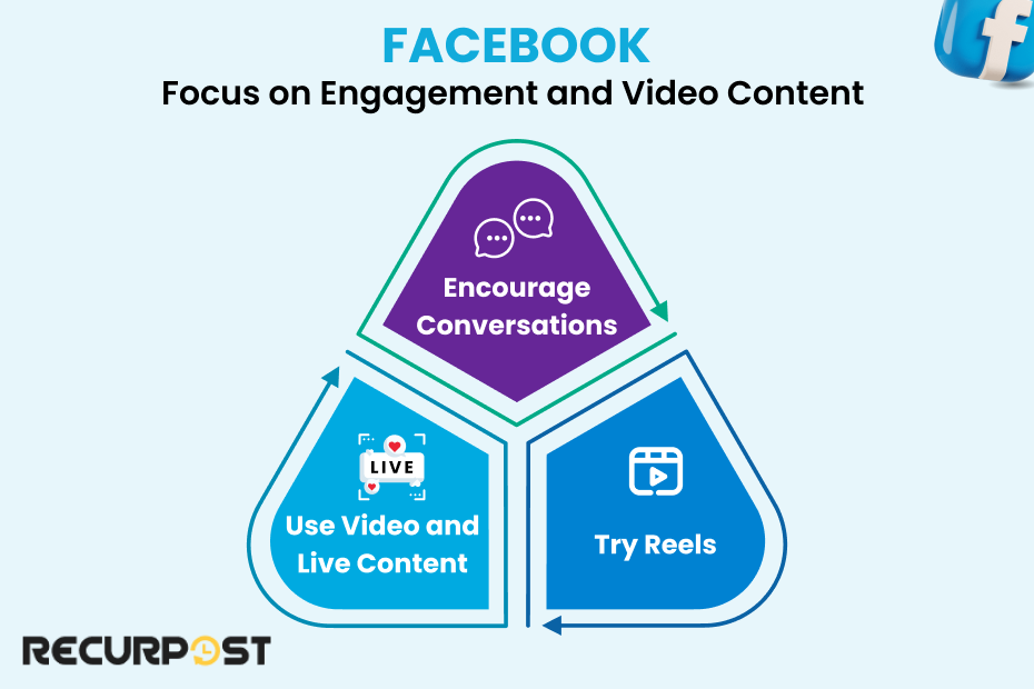
- Encourage Conversations: Facebook algorithm loves meaningful posts that start conversations. Try asking questions or creating polls to get people talking.
- Use Video and Live Content: Facebook prioritizes videos, especially live videos. It’s smart to schedule posts with Facebook to ensure timely delivery and engagement. People spend more time watching live videos, and Facebook rewards those who watch for a bit of algorithm love.
- Try Reels: Facebook has jumped on the short video train, so posting or scheduling reels to your strategy can give your content an extra push.
2. Instagram: Get Interactive with Stories and Reels
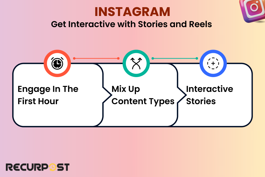
- Engage in the First Hour: The Instagram algorithm takes early engagement as a good sign. So, respond to comments quickly and aim to post when your followers are online.
- Mix-Up Content Types: Use a blend of Feed posts, Reels, and Stories to keep things interesting. Instagram rewards creators who use multiple features.
- Interactive Stories: Use polls, questions, and countdowns in Stories. They’re fun, quick to respond to, and boost engagement, exactly what Instagram wants.
3. TikTok: Hop on Trends and Keep It Short
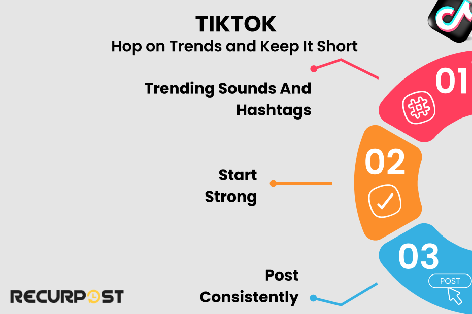
- Trending Sound and Hashtags: TikTok ‘For You’ page thrives on trending content. Using popular sounds or hashtags along with relevant hashtag examples can put your post in front of a wider audience.
- Start Strong: TikTok decides quickly if your content is interesting, so hook viewers in the first 3 seconds.
- Post consistently: The TikTok algorithm tends to reward regular posters. Aim for a few times a week to stay visible.
4. Twitter: Stay Timely and Use Hashtags

- Join Trending Topics: Twitter algorithm pushes tweets related to trending topics, so it’s worth jumping into relevant conversations.
- Be Present and Active: Frequent posting works well on Twitter. Since it’s a real-time platform, tweeting consistently keeps you in the loop.
- Use Hashtags Wisely: Stick to one or two relevant hashtags per tweet. It helps with reach without looking spammy.
5. LinkedIn: Aim for Early Engagement and Professional Value
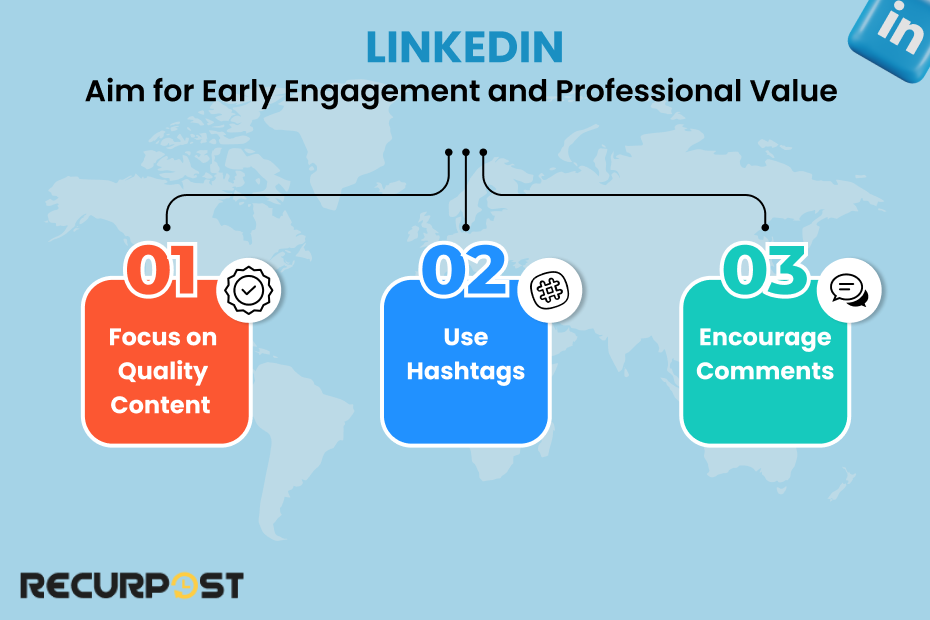
- Focus on Quality Content: LinkedIn algorithm loves posts that get early likes and comments, so make sure your content is valuable and relevant to your industry.
- Use Hashtags: Adding a few relevant hashtags can help LinkedIn categorize your content and show it to the right people.
- Encourage Comments: LinkedIn ranks posts higher when they get meaningful comments. Consider ending your posts with a question to prompt responses.
6. YouTube: Maximize Watch Time and Engagement
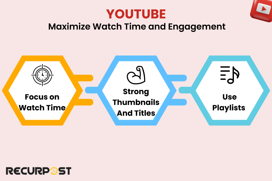
- Focus on Watch Time: YouTube prioritizes videos that keep people watching, so make sure your content is engaging from start to finish.
- Strong Thumbnails and Titles: A catchy thumbnail and title can grab attention and improve your click-through rate, which is another signal YouTube’s algorithm loves.
- Use Playlists: Organize related videos into playlists to keep viewers on your channel longer.
7. Pinterest: Optimize for Quality and Keywords

- Create High-Quality Pins: Use clear, high-quality images and keyword-rich descriptions. Pinterest’s algorithm loves visuals that pop.
- Link to Valuable Content: If you link your pins to a helpful website or blog, the Pinterest algorithm is more likely to give you a boost.
Consistency is Key: Pinterest likes regular posting, so aim for a steady stream of new pins.
These tips work best when you use them together with a bit of creativity and experimentation. Algorithms love fresh, engaging content, so keep testing what works for your audience.
Common Misconceptions about Social Media Algorithms
Social media algorithms can feel like a mystery, and with all the myths floating around, it’s easy to get confused. Let’s bust a few of the biggest misconceptions about how these social media algorithms actually work:
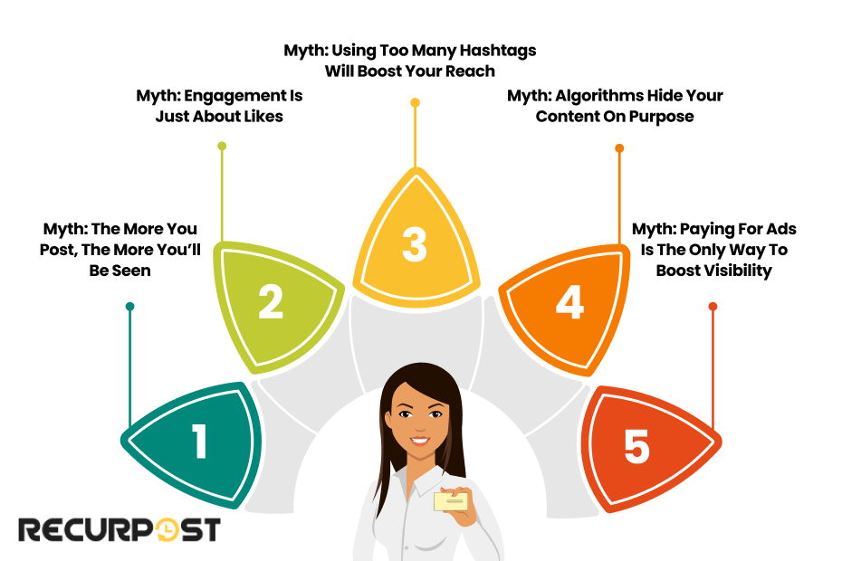
1. Myth: The More You Post, the More You’ll Be Seen
Posting often can help with visibility, but flooding your social media accounts won’t necessarily improve your reach. Quality matters more than quantity, and algorithms reward high-quality content over a constant stream of posts. Instead, focus on sharing relevant content that your audience actually wants to engage with.
2. Myth: Engagement is Just About Likes
Likes are great, but the key ranking signals most platforms look for are comments, shares, and saves. These interactions signal to the social platform that your post is valuable and interesting. So, encourage real conversations and interactions rather than simply counting likes.
3. Myth: Using Too Many Hashtags Will Boost Your Reach
Hashtags are useful, but overusing them can backfire. Platforms like Instagram recommend using a handful of relevant hashtags instead of spamming every post with dozens. The ranking signals used by social media algorithms actually prefer content that’s well-targeted over posts that are hashtag-heavy.
4. Myth: Algorithms Hide Your Content on Purpose
Ever heard about “shadow banning”? It’s a big term among social media users, especially on platforms like Instagram. The truth is that social media algorithms don’t hide your content; they just prioritize it based on relevance and engagement. If a post doesn’t get much interaction, it’s less likely to appear in users’ feeds, but that’s not the same as being “banned” or “hidden.”
5. Myth: Paying for Ads is the Only Way to Boost Visibility
While ads can help, they’re not the only way to improve reach. The algorithms on social media platforms actually reward user interactions on organic content just as much as on paid posts. Creating high-quality content that engages users naturally can get you great results without any ad spending.
Understanding these misconceptions helps us see why social media algorithms exist in the first place to ensure users’ feeds stay full of relevant content they’re likely to enjoy.
Creating an Algorithm-Friendly Content Strategy
Now that we’ve debunked a few myths, let’s talk about how to make content that social media algorithms love. Whether you’re trying to boost engagement, gain more visibility, or attract a wider audience, these strategies will help your content rank higher across platforms:
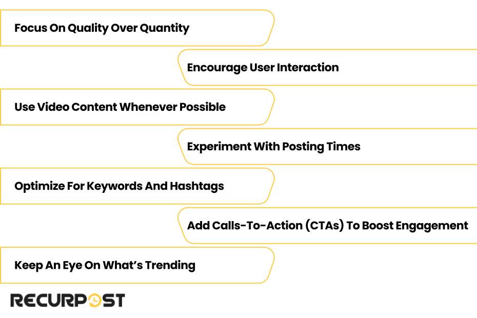
1. Focus on Quality Over Quantity
Algorithms are designed to prioritize high-quality content. Instead of posting as much as possible, focus on creating posts that your target audience will find valuable. Think about what they want to see, learn, or talk about, and create content that delivers just that.
2. Encourage User Interaction
Platforms use user engagement as a big ranking factor. To encourage more comments, shares, and saves, try using questions in your captions, creating polls, or sharing thought-provoking content that invites interaction. The more people engage with your content, the better it’ll perform in the feed algorithm.
3. Use Video Content Whenever Possible
The video has become one of the top-ranking content types on nearly every social media platform. Whether it’s short clips on TikTok, Reels on Instagram, or Stories on Facebook, video content captures attention. Algorithms recognize that users spend more time on videos, so it’s a format that can help boost reach and engagement.
4. Experiment with Posting Times
The timing of your posts can impact how they perform in users’ feeds. While no magic hour works for everyone, experimenting with posting at different times can help you understand when your audience is most active. Posting when your followers are online can lead to quicker interactions, which can improve your post’s relevancy score and keep it visible longer.
5. Optimize for Keywords and Hashtags
Just like SEO, algorithms on platforms like Instagram, TikTok, and Pinterest use keywords and popular hashtags to categorize content. Choose relevant hashtags and keywords that match your content and audience’s interests. This helps the algorithm connect your post with the right users and boosts the chances of appearing on the explore page or search results.
6. Add Calls-to-Action (CTAs) to Boost Engagement
Sometimes, a simple nudge is all it takes! Use CTAs to encourage actions like “Save this post,” “Share with a friend,” or “Leave a comment.” Social media algorithms see these interactions as valuable, so adding a CTA can be a smart way to get a bit more engagement out of each post.
7. Keep an Eye on What’s Trending
Trends can be a helpful boost for visibility. Social platforms prioritize content that’s aligned with current trends, whether it’s a challenge on TikTok or a popular audio track on Instagram. Keeping up with what’s trending, especially video marketing trends, and finding creative ways to tie it into your brand can help you reach a broader audience.
8. Smart Automated Posting Without Triggering Spam Filters
Automated posting can save time, but social media algorithms have become smarter at detecting and penalizing content that appears robotic or spammy. Here’s how to use automation while staying in the algorithm’s good graces:
- Vary Your Posting Patterns:
Avoid posting at exactly the same times every day. Mix up your schedule slightly so your content doesn’t appear too mechanical to the algorithm.
- Personalize Automated Content:
Even when scheduling posts in advance, make sure each piece of content feels authentic and relevant to current events or conversations happening in your community.
- Monitor and Engage in Real-Time:
Automation works best when combined with genuine human interaction. Set aside time to respond to comments and engage with your audience personally, even on automated posts.
- Use Platform-Native Scheduling:
Whenever possible, use the built-in scheduling features of each platform rather than third-party tools, as algorithms tend to favor content posted through official channels.
- Test Automated vs. Manual Performance:
Track how your automated posts perform compared to manually posted content. If you notice a significant drop in engagement on automated posts, adjust your strategy accordingly.
By building an algorithm-friendly content strategy, you’ll set yourself up for more engagement and higher visibility on your favorite social media platforms. Keep these strategies in mind as you plan out your posts, and watch how the algorithms respond.
Tracking and Measuring Your Success
Creating content that’s friendly to social media algorithms is a great start, but the real magic happens when you track how well your content is performing. By monitoring your results, you’ll know what’s working, what’s not, and how to make smarter decisions going forward.
Here’s how to keep an eye on those important numbers:
1. Identify Key Metrics for Each Platform
Each platform has its own set of metrics that tell the algorithm your content is engaging. On Facebook and Instagram, focus on engagement rates (likes, comments, saves, and shares). On YouTube, watch time and average view duration are big indicators of success. For LinkedIn, early engagement (like comments and reactions) plays a major role. Identifying these metrics helps you focus on what matters most for each platform’s algorithm.
2. Use Analytics Tools to Monitor Performance
Nearly all social media platforms offer built-in analytics, but using additional tools like RecurPost can give you even deeper insights. Tools like this track ranking signals across platforms and help identify trends in your content’s performance. For example, if your posts with video content tend to get more engagement, that’s a sign to make more videos.
3. Conduct A/B Testing for Optimal Results
Not sure which type of content will perform best? Run some A/B tests! Try out two different types of posts to see which one performs better. This can be as simple as testing different posting times, captions, or visuals. By analyzing results, you’ll learn what your audience engages with most, and that’ll keep your posts in the algorithm’s favor.
4. Track Your Audience’s Interaction History
Platforms look at interaction history to decide what users see more of. By monitoring which posts get saved, shared, or commented on frequently, you can get a clear view of what resonates with your followers. This helps you shape future content that keeps them coming back.
5. Adjust Based on Data-Driven Insights
Algorithms change, and so do audience preferences. Regularly reviewing your data gives you the chance to adapt your strategy. If you see engagement dropping on a particular type of post, switch things up. Maybe it’s time to try a trending format like Reels or posts at different times. Algorithms reward agility, so staying flexible is key.
Tracking engagement metrics and adapting your approach creates a responsive, effective long-term marketing strategy. This requires ongoing attention and adaptation as you discover what works best.
Conclusion
Understanding and working with social media algorithms doesn’t have to be a mystery. By focusing on high-quality content, encouraging user engagement, and keeping up with algorithm trends, you can improve your reach and visibility across platforms.
Remember to track your results and stay flexible, adjusting your strategy as needed. With these tips, you’re well on your way to making social media algorithms work for you.
FAQs on Social Media Algorithm
1. How often do social media algorithms change?
Algorithms change frequently, sometimes without notice, as platforms tweak them to improve user experience. Major updates happen a few times a year, but small adjustments can happen weekly or even daily.
2. What are some signs that an algorithm change has affected my content?
If you notice a sudden drop or spike in engagement, reach, or impressions, it might be due to an algorithm change. Reviewing analytics data can help you identify if there’s a pattern or if certain content types are now performing differently.
3. Is there a way to reset or “refresh” an algorithm’s view of my content?
Yes! Engaging more directly with followers, posting consistently, and experimenting with new content formats (like Stories, Reels, or live videos) can help re-engage the algorithm and improve visibility.
4. Does adding links in social media posts reduce reach?
On some platforms, especially Facebook, posts with external links can sometimes reach fewer users than posts with native content. Consider putting the link in the comments or balancing link posts with more engaging, non-link content.
5. How does the algorithm treat personal accounts vs. business accounts?
Some platforms, like Instagram, claim there’s no difference in reach between personal and business accounts. However, business accounts may have access to tools and insights that can help track performance, which is an advantage in itself.
6. Does deleting a post affect my account’s performance in the algorithm?
Deleting posts doesn’t usually harm your account. However, if you consistently delete posts with low engagement, it might signal to the algorithm that your content isn’t engaging, so consider leaving up older posts and focusing on improving future ones.
7. Are “likes” or “shares” more important for the algorithm?
Generally, shares, saves, and comments are more valuable than likes because they signal deeper engagement. Algorithms prioritize content that sparks meaningful interactions over simple likes.
8. How can I get my content on the Explore page of Instagram or the For You page on TikTok?
To appear on these pages, focus on high-engagement content. Use trending sounds, hashtags, and consistently create quality content that encourages comments, saves, and shares. Engaging with similar content in these sections also increases your chances.
9. Does switching up content type (video vs. photo) make a difference?
Yes, algorithms generally prioritize video content due to its higher engagement rates. Platforms like Instagram and TikTok especially favor video formats like Reels and Stories.
10. Can hashtags still impact reach on social media platforms?
Yes, hashtags help algorithms categorize your content and show it to users interested in similar topics. Just use relevant, targeted hashtags rather than overloading posts with too many.
11. How did the August 2025 algorithm changes affect content visibility?
The August 2025 updates across platforms like Instagram, TikTok, and LinkedIn placed greater emphasis on authentic engagement and original content. Posts with genuine interactions now receive better visibility, while content with suspected artificial engagement sees reduced reach. Creators who focus on building real communities and producing original content have generally seen improved performance since these updates.
12. Can I use automated posting tools without hurting my algorithm performance?
Yes, but you need to be strategic about it. Social media algorithms can detect overly mechanical posting patterns, so vary your posting times, personalize your content, and always engage authentically with your audience. Use platform-native scheduling tools when available, and monitor your automated posts’ performance compared to manual posts to make sure you’re not seeing a drop in engagement.

Saurabh Chaturvedi is a content writer at RecurPost. Specializing in social media management and marketing, Saurabh is dedicated to crafting engaging and informative articles. His passion for clear, exciting content keeps readers eager for more.