In 2025, as social media continues to expand, Social media Call-To-Action has become necessary. With so much content online, even high-quality posts get ignored without engagement invitations. Great content alone isn’t enough anymore.
You may have noticed that your relevant, well-made content lacks likes, shares, or comments, a common issue for influencers, business owners, and content creators.
Engagement drives visibility. Algorithms favor interactive content. People who enjoy posts won’t act without prompting. Without engagement, profiles and businesses stagnate.
That’s where Call-To-Actions come in. Simple lines like “Save this post,” “Tag a friend,” or “Like now” encourage users to engage, helping turn attention into action and boosting both traffic and reach.
The right social media call-to-action strengthens your marketing strategy. CTAs must align with specific goals: driving traffic, building awareness, or boosting conversions.
Read the full article to sharpen your CTA skills and start turning your engagement into real website visitors.
Social Media Call-to-Action Explained
The Tiny Text That Drives Big Results
CTA stands for Call-To-Action, which represents a short and clear message that encourages social media users to take the next step toward engagement or conversion.
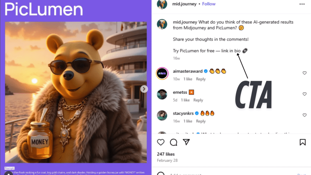
MidJourney recently shared a carousel post featuring a character Piclumen, styled in 10 unique and visually striking AI-generated versions.
In the caption, they encouraged viewers to try creating similar characters themselves, directing them to the link in their bio.
A call to action example that works well is “Link in bio,” which MidJourney uses because this CTA not only engages users but also increases traffic to their website and application.
A call to action works by prompting various user behaviors such as signing up for newsletters, clicking links to external content, making purchases, or leaving comments that boost engagement metrics.
Social Media Call-To-Action vs. General CTA
General CTAs on websites and emails use buttons like ‘Buy Now,’ ‘Download Now,’ or ‘Subscribe Now’ for direct actions. Social media Call-To-Actions focus on engagement and traffic generation, sparking interaction, building relationships, and expanding content reach.
Common examples include:
- “Link in bio”
- “Tag a friend”
- “Visit our website”
Social media call-to-action examples are specially tailored for platforms like Instagram, Facebook, and Pinterest because these CTAs align with the fast-paced, scroll-friendly nature of social platforms while incorporating emojis, hashtags, and compelling visuals that boost attention and clicks.
Social media CTAs use short phrases and fun designs, while general CTAs maintain formal, direct approaches.
Social media CTAs guide users through brand journeys, while general CTAs prompt immediate, specific actions.
Social Media Call-To-Action
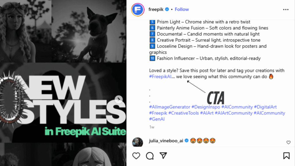
Freepik, in one of their carousel posts, effectively utilized two strategic CTAs placed in the caption: “Save this post for later” and “Tag your friends.”
These CTAs are powerful engagement techniques designed to boost both reach and interaction, encouraging users to take simple yet meaningful actions that extend the post’s visibility and impact.
General Call-to-action
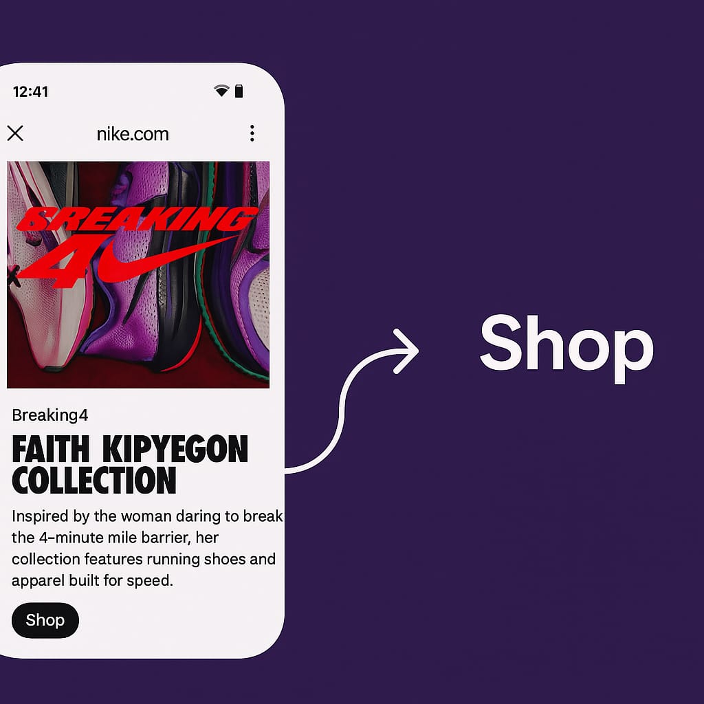
Nike uses a shop button to encourage users to purchase the product.
Social Media CTA vs General CTA – Detailed Comparison Table
| Feature / Criteria | Social Media CTA | General CTA |
| Primary Platform | Social media platforms (Instagram, Facebook, LinkedIn, X, etc.) | Websites, landing pages, emails, paid ads |
| Main Objective | Engagement → Traffic (clicks, likes, shares → visit website) | Direct conversion (sign-ups, purchases, downloads) |
| Tone of Voice | Conversational, casual, trendy | Professional, formal, direct |
| Format | Short text, emojis, hashtags, “link in bio”, swipe-ups | Buttons, links, forms, banners |
| Placement | Captions, stories, reels, pinned comments, bio sections | Website headers, pop-ups, end of blog posts, email footers |
| Visual Appeal | Visually dynamic (GIFs, reels, emojis, stickers) | Clean and functional (buttons, highlighted sections) |
| User Journey Stage | Early to mid-stage (awareness, interest, engagement) | Mid to late stage (decision, action) |
| Action Example | “Click the link in bio”, “Swipe up to read more”, and “Save this post”. | “Download Now”, “Get Started”, “Subscribe”, “Add to Cart” |
| Traffic Direction | Mostly external (social post → website/blog/product page) | Internal or external (within site or to conversion endpoint) |
| Tracking Tools | UTM links, link shorteners, Instagram Insights, Facebook Pixel | Google Analytics, CRM tools, marketing automation platforms |
| Urgency/Triggers Used | FOMO, trending hashtags, engagement hooks | Value-driven benefits, discount offers, and time-limited deals |
| Conversion Intent | Indirect (via interest or curiosity) | Direct (immediate signup or purchase) |
| Success Metric | Click-through rate (CTR), website visits, and content shares | Conversion rate, lead count, and purchase completions |
| Content Type Matched | Carousels, short-form videos, image posts, stories | Blog posts, landing pages, long-form sales pages |
| Best For | Increasing visibility, building traffic pipelines to your website | Closing deals, capturing leads, and onboarding users |
| Adaptability | Quick to change, platform-algorithm dependent | Instagram post: “Want more tips? Tap the link in the bio to explore.” |
| Example Scenario | Instagram post: “Want more tips? Tap the link in the bio to explore.” | Website landing page: “Sign up now to start your free trial.” |
Why You Should Use Call-To-Action
The Psychology That Makes People Click
Understanding psychological triggers that drive action transforms CTAs from suggestions into compelling commands.
The Power of Loss Aversion
Humans fear loss more than they value gain. “Don’t miss out” outperforms “Get access” because brains interpret potential loss as an immediate threat, triggering faster decisions.
For social media Call-To-Actions, urgency-based language works best. “Last chance to join” motivates more strongly than “Join our community”. Fear of missing opportunities overrides action hesitation.
Social Proof as a Decision Shortcut
During decision uncertainty, people seek guidance from others. CTAs with social proof – “Join 10,000+ entrepreneurs” or “See why everyone’s talking about this”, provide reassurance that drives clicks.
Social proof reduces perceived risk. When thousands take a safe action, others view it as worthwhile. CTAs shift from self-promotion to community participation.
Curiosity Gaps Drive Clicks
Brains crave completion. Information gaps, “The result will surprise you”, or “See what happened next”, trigger irresistible urges to discover missing pieces.
Balance revelation with mystery by providing value while withholding crucial details that require clicks to discover. This technique excels for educational content and behind-the-scenes reveals.
Schedule smarter with RecurPost and ensure every post includes the perfect CTA at the right time.
Authority Reduces Friction
People follow recognized experts and trusted sources. CTAs positioning you as an authority, “Get the method I used to…” or “Access my proven framework”, leverage this natural tendency.
Authority requires demonstration through content quality, social proof, and genuine expertise, not mere claims.
Social Media Call-To-Action Context
CTA context starts with knowing its types.
This helps you choose the right CTA based on the purpose of your post. The nature of a CTA often changes depending on the customer’s journey.
For example, in a digital marketing campaign post where the goal is to promote a course, a suitable social media Call-To-Action would be: “Join our course.”
However, if someone is showcasing products and the reader shows interest, such as liking the post, they’re likely to consider a purchase. In this case, a hard CTA like “Buy Now” would be more effective.
That’s why it’s important to match your CTA with the user’s intent and the type of content you are sharing.
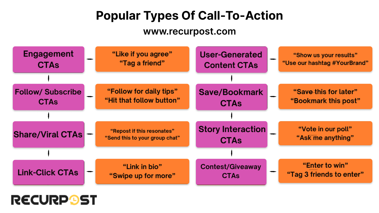
Popular Types Of Social Media Call-To-Action In 2025
Examples of call-to-action phrases vary by purpose and include engagement-focused CTAs like “Save this post” and “Tag a friend,” traffic-driving CTAs such as “Link in bio” and “Visit our website,” and conversion-oriented CTAs, including “Shop now” and “Sign up today,” which guide users through different stages of the
Call-To-Action Tips For Each Social Media Platform
Each social media platform uses different algorithms and content preferences. CTAs successful on one platform may fail on another. Match CTAs to specific platforms for optimal results.
Instagram: Blend Aesthetic with Action
You’ve got seconds to catch someone’s eye, so your personalized CTA has to feel like part of the post, not a random add-on.

Feed Posts
Call to action: Social media copy should guide people without sounding forced, such as using “Swipe to see the before shot” for transformation photos, because this phrasing feels natural and encourages user interaction.
Sharing a product or outfit? Try:
Instagram call-to-action examples that perform well include “Save this for your next shopping run,” which adds value to users, and “Swipe to see the before shot,” which feels natural for transformation content.
Also, don’t rely on text alone. Use:
- Visual cues like arrows
- Overlays
- Finger-pointing emojis
Even something as simple as pointing toward your bio link can push more people to click.
Stories
Stories are quick and temporary, so your social media Call-To-Action should feel just as fast.
Good examples:
- “Swipe up before it’s gone.”
- “DM me ‘YES’ if you want the details.”
These work because they tap into the urgency of Stories.
Also, use built-in engagement tools like:
- Polls
- Sliders
- Question boxes
They get people involved without asking too much.
Try pairing something like:

Reels
Reels are about momentum. You don’t want to break the flow with a sales line at the end.
Instead, make your social media Call-To-Action part of the story:
- “Follow to catch the full recipe tomorrow.”
- “Watch till the end, this part’s wild.”
People scroll fast, so the smoother your CTA fits into the content, the better chance they’ll stick around or take action.
Facebook Isn’t Just About Likes Anymore
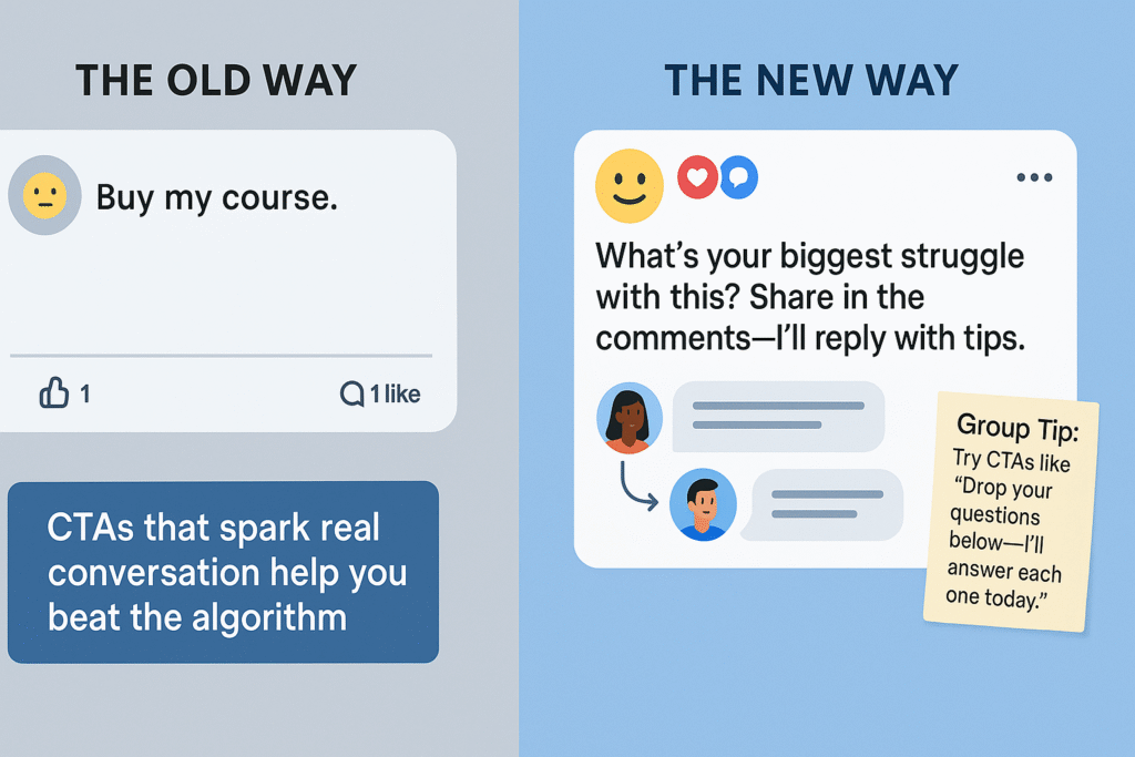
In 2025, the algorithm favors content that gets people talking. That means your social media Call-To-Actions should focus less on quick clicks and more on starting meaningful discussions.
Shift from Selling to Starting Conversations
For example, if you’re sharing tips or talking about a common challenge, avoid hard-sell lines like:
“Buy my course.”
Instead, go with something like:
“What’s your biggest struggle with this? Share it in the comments, and I’ll reply with tips.”
This kind of social media Call-To-Action invites people to engage and helps you show up as someone who’s there to help, not just sell.
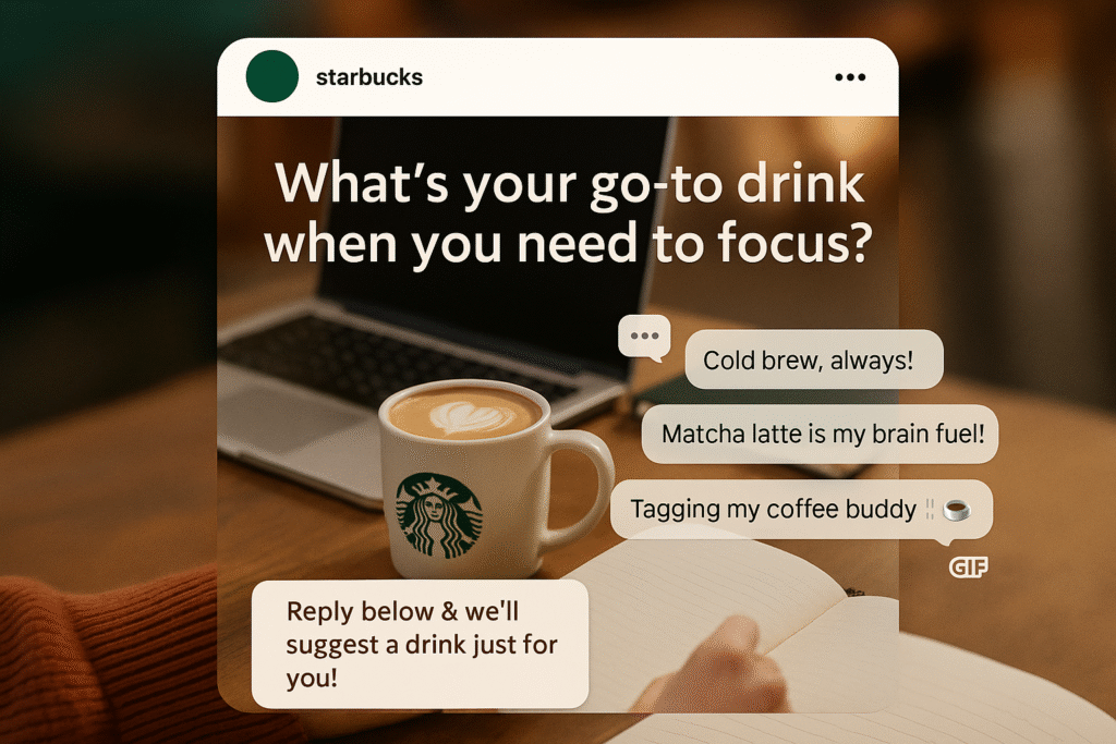
Starbucks often uses this exact approach. Instead of pushing products directly, they post conversation-driven questions like:
Then they follow up with:
- Replies
- Gifs
- Even custom drink suggestions
It feels friendly, personal, and most importantly, relatable. The post doesn’t just sell coffee, it builds community.
Bonus Tip: If You’re Managing a Facebook Group
You’ve got even more room to connect. Members expect more direct interaction.
Try a CTA like:
“Drop your questions below—I’ll answer each one today.”
It makes the experience feel one-on-one. It’s a small gesture, but it builds loyalty.
What does that mean?
When people feel heard, they’re more likely to engage. And that’s exactly what the Facebook algorithm looks for: real interaction, not just traffic. CTAs that:
- Spark comments
- Invite opinions
- Ask thoughtful questions
…often perform better than plain promos.
LinkedIn: Professional Value Exchange
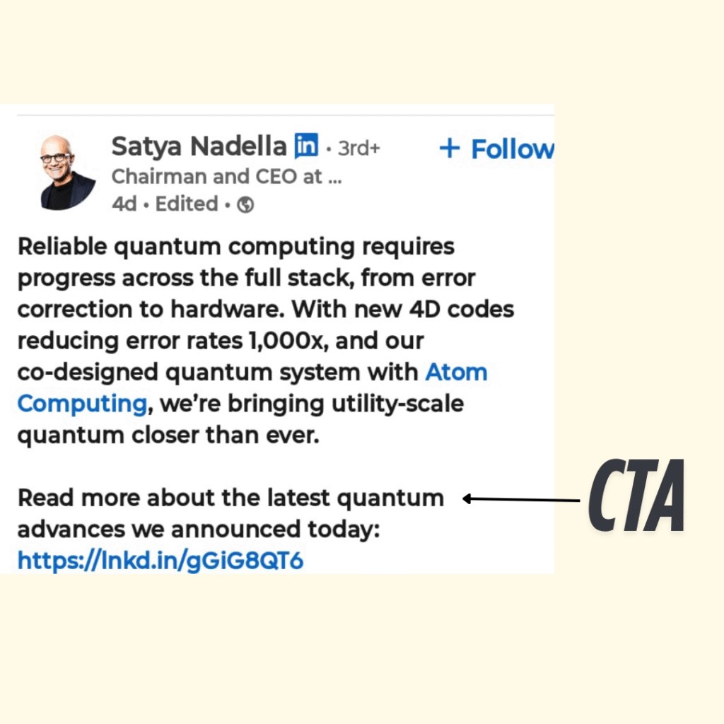
LinkedIn users consume content during work hours and expect professional value. Your CTAs must respect this environment while still driving business outcomes.
Use Value-Forward social media Call-To-Action
Value-forward CTAs work best on LinkedIn.
For example:
“Download the framework that helped me [specific result]”
This appeals to the desire for professional improvement. Users engage with content that helps them:
- Work smarter
- Solve a challenge
- Grow in their career.
Thought Leadership Wins
The platform rewards:
- Expert positioning
- Insightful, actionable content
CTAs that invite professional discussion also perform well, such as:
“What’s been your experience with this strategy?”
These types of CTAs:
- Spark conversation
- Build your credibility
- Encourage thoughtful comments and shares.
LinkedIn Articles = social media Call-To-Action Goldmine
LinkedIn Articles give you space to:
- Explain exactly what readers gain by taking action
- Address objections upfront.
- Provide clear next steps.
This format is ideal for:
- B2B service providers
- Consultants
- Industry educators
You’re not just asking for engagement, you’re offering solutions worth their attention.
TikTok and YouTube Shorts: Entertainment Meets Engagement
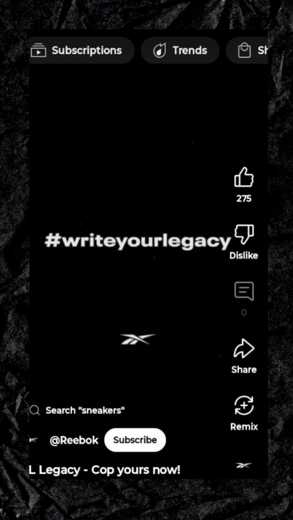
Short-form video platforms blend entertainment with education. Your CTAs must feel fun and natural, not overly promotional.
Use Entertainment-First social media Call-To-Action
Entertainment-First CTAs perform best here.
For example:
“Comment a 🔥 if you want part 2”
This turns engagement into participation; it feels like part of the fun, not a marketing tactic.
Keep It Casual and Conversational
The platforms’ younger demographics respond best to:
- Casual tone
- Relatable phrasing
- Authentic personality
Instead of formal calls to action, try something like:
“Follow for more tips like this.”
This feels genuine and fits the creator-first culture. Users expect to connect with real people, not corporate voices.
Series-Based Social Media Call-To-Action = More Reach + Follower Growth
These platforms love consistent content from active creators. CTAs that build anticipation work especially well.
Try:
“Part 1 of 3 – follow so you don’t miss the rest”
This:
- Triggers curiosity
- Encourages follows
- Increases watch time across multiple videos.
It’s a win-win for both visibility and engagement.
Industry-Specific CTA Formulas: Speaking Your Audience’s Language
Different industries require different CTA approaches because target audiences have different motivations, pain points, and decision-making processes. Here’s how to craft CTAs that resonate with specific markets:
CTA for Coaches and Educators: Transformation Focus

@cathymadeoyoga @adrienelouise
Your audience seeks personal or professional improvement. They’re motivated by transformation and frustrated by current limitations.
Transformation-Based CTAs
“Get the system that helped me go from [before state] to [after state]”
- Communicates potential outcomes
- Be specific:
“Increase income by 50%” beats “Make more money”.
Urgency CTAs
“Stop struggling with [problem] – get the solution now.”
- Leverage the pain of staying stuck.
- Urgency feels supportive, not pushy.
Community CTAs
“Join entrepreneurs getting real results.”
- Appeals to the desire for connection and accountability
- Many in self-improvement spaces feel that an isolated community is a solution.
E-commerce: Purchase Decision Support
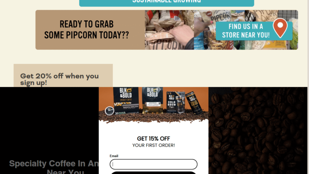
Your audience may be:
- Browsing
- Comparing
- Ready to buy but hesitant
Scarcity CTAs
“Only 3 left in stock.”
“Sale ends tonight.”
- Creates urgency
- Must be genuine, false scarcity damages trust
Social Proof CTAs
“Join 5,000+ happy customers”
“See why everyone’s switching to [product]”
- Overcomes hesitation
- Builds confidence through crowd reassurance
Value Reinforcement CTAs
“Get free shipping on orders over $50.”
- Encourages higher spend
- Highlights added value
Real Estate: Trust and Expertise Building
Real estate involves high stakes, both emotional and financial. CTAs need to build trust and credibility.
Value-First CTAs
“Get your free home valuation.”
- Offers immediate value
- Helps generate qualified leads
Local Authority CTAs
“See what’s selling in [neighborhood]”
- Positions you as the local expert
- Builds trust by showing market insight
Process Education CTAs
“Download the first-time buyer’s guide.”
- Reduces anxiety, especially for new buyers
- Also, captures lead info for future follow-up.
SaaS and Technology: Problem-Solution Focus

Your audience is technical, efficiency-driven, and looks for clear ROI.
Free Trial CTAs
“Try free for 14 days – no credit card required”
- Lowers risk
- Let the product speak for itself.
Specific Benefit CTAs
“Save 5 hours per week with automated [process]”
- Speaks directly to pain points
- Quantifies the value clearly
Demo CTAs
“See exactly how it works in your business.”
- Reduces uncertainty
- Helps buyers visualize implementation
Social Media Call-To-Action Placement Strategy
Timing and Positioning for Maximum Impact
Even the most compelling CTA fails without strategic placement. Knowing where and when to include your call-to-action can double or triple your conversion rates.
The Opening Hook Strategy
Sometimes, leading with your social media Call-To-Action creates the strongest impact.
This works well for:
- Time-sensitive offers
- Audiences that already know your value
Example:
“Flash sale: 50% off everything – shop now”
This immediately communicates:
- Urgency
- Value
- Clear next step
Ideal for: Loyal followers who don’t need convincing
But beware:
- This strategy requires an established audience.
- New followers may ignore the CTA without context or proof of value.
The Value-First Approach
In most cases, providing value before the CTA works best.
Why?
- Builds trust
- Shows your expertise
- Creates a feeling of reciprocity
Example:
“Now that you understand [concept], get the complete guide that covers everything.”
This feels:
- Natural
- Helpful
- Not pushy
Ideal for: Educational social media posts, tips, how-tos, and content aimed at building credibility.
The Story Arc Method
For longer content, embed your CTA within a story.
Structure:
- Start with a problem or a relatable question
- Build curiosity or tension.
- Offer a taste of the solution.n
- Present your CTA as the next logical step.
This method:
- Keeps people engaged
- Makes the CTA feel like the resolution to a story
- Works especially well for behind-the-scenes or educational content
Ideal for: YouTube videos, blog posts, longer Reels or TikToks, LinkedIn articles
Tips For Writing Compelling CTAs
We’ve now broadly discussed how Calls-To-Action (CTAs) should be tailored based on different platforms and sectors. Now, let’s explore the key elements you should focus on when crafting an effective CTA in general.
- Know your audience
Understand their pain points, interests, and what motivates them to take action.
- Align with campaign goals.
Tailor your CTA to match your specific objective: lead generation, conversions, sign-ups, etc.
- Focus on action words.
Use strong, directive verbs like Download, Try, Get, or Discover to drive clarity and intent.
- Emphasize benefits
Highlight what users will gain: “Save time”, “Get expert insights”, or “Improve your results”.
- Keep it short and clear.r
Aim for 3–7 words. Concise CTAs perform better across platforms.
- Make it actionable
Avoid vague phrases. Be clear about the next step you want the user to take.
- Create a sense of urgency.
Use time-sensitive triggers like “Today only”, “Enroll now”, or “Last chance”.
- Make it visually stand out.t
Use contrasting colors, bold fonts, and smart placement to attract attention.
- Test and optimize
Regularly run A/B tests to improve CTA performance and increase conversions.
Common CTA Mistakes That Kill Conversions
Understanding what doesn’t work is equally important as knowing effective strategies. These common mistakes can destroy otherwise excellent content performance.
Vague Value Propositions
“Click here for more information” tells audiences nothing about what they’ll gain. Specific benefits always outperform generic requests.
Instead of “Join our newsletter”, use “Get weekly marketing tips that doubled our client’s revenue”. The specific outcome makes the action worthwhile.
Competing CTAs
Multiple calls to action in a single post confuse audiences and dilute responses. “Like, share, comment, subscribe, and visit our website” overwhelms rather than guides.
Choose one primary action per post. You can include secondary requests, but make your main CTA unmistakably clear.
When Secondary CTAs Work in Social Media Posts
Secondary CTA in social media post strategies work when this additional calls-to-action support your main goal without competing with the primary action, particularly for capturing users who aren’t ready for the primary commitment level.
For example, if your primary CTA is “Download our free guide”, a secondary CTA might be “Follow for more tips like this”. The secondary action captures users who want to stay connected but aren’t ready to download.
Best practices for secondary CTAs:
- Place the secondary CTA after the primary one
- Make the secondary action smaller or less prominent visually
- Use secondary CTAs that require less commitment (follow vs. purchase)
- Test single CTA posts against posts with secondary CTAs to measure performance
Secondary CTAs work particularly well in Instagram Stories, where you can use stickers for the primary action and include a subtle “Follow us” as secondary text, or in LinkedIn posts, where “Share your thoughts below” can complement “Download the whitepaper.”
Mismatched Tone and Audience
Corporate language for creative audiences, casual tone for professional contexts, or urgent pressure for relationship-focused content creates a disconnect between the message and audience expectations.
Study successful accounts in your industry to understand tone preferences, then adapt to match while maintaining an authentic voice.
Premature Selling
Requesting major commitments before building trust destroys potential relationships. Audiences need value demonstration before they risk time, money, or personal information.
Follow the 80/20 rule: 80% valuable content, 20% promotional requests. This ratio builds trust while still driving business outcomes.
Transform Your Social Media Results Starting Now
Social media success isn’t about perfect content or massive followings; it’s about moving people from passive observation to active engagement. Your call to action bridges this gap and determines whether your social media campaign generates real business results.
The strategies, templates, and insights in this guide provide everything needed to improve your social media conversion rates dramatically. However, success requires consistent implementation and ongoing optimization based on your specific audience responses.
Start with one platform and one CTA improvement. Test systematically, measure results, and scale what works. Small improvements compound into significant business growth when applied consistently over time.
FAQS About Social Media Call-To-Action
1. What makes a good CTA on Instagram?
A good CTA on Instagram is short, visually engaging, and action-oriented. Use phrases like “Tap to shop,” “Save this post,” or “DM us for details.” Pair it with emojis, stickers, or visual cues like arrows to increase interaction. It should feel natural and aligned with your caption or story content.
2. How do CTAs affect engagement on social media?
CTAs significantly boost engagement by prompting users to take action, such as liking, commenting, or sharing. They increase visibility through algorithmic favor, spark interaction, and help build stronger community ties. Without CTAs, users are less likely to engage, even if they enjoy the content.
3. Should every social media post include a CTA?
Yes, most posts benefit from including a CTA, even if it’s subtle. A CTA guides the viewer toward your goal, whether that’s commenting, saving, clicking, or sharing. However, vary your CTA style to keep content natural and avoid sounding overly promotional or repetitive.
4. How do you measure the success of a social media CTA?
Success is measured through metrics like click-through rate (CTR), engagement rate, link clicks, shares, and conversions. Use analytics tools like Instagram Insights, Facebook Analytics, or UTM links to track performance. High-performing CTAs show increased traffic or desired actions from your audience.
5. Why are CTAs important in social media marketing?
CTAs are crucial in social media marketing because they drive user engagement, increase conversions, and guide users toward your business goals. Without CTAs, even great content may fail to convert. A well-placed CTA turns passive viewers into active participants, growing your reach, leads, and sales.

Fenil Patel is a content writer specializing in social media marketing. He creates engaging, results-driven content that helps brands grow online, connect with audiences, and boost digital visibility. With a sharp eye for trends and strategy, he turns ideas into content that performs. Fenil is passionate about helping businesses stand out in the fast-paced world of digital marketing.
